Choosing a color scheme for a multifamily housing project can be daunting. From selecting the right colors to get the desired look and feel, to finding a way to make each space unique but still cohesive, the task of designing a multifamily housing project is no small feat. One of the ways professionals have been exploring design in these spaces is through monochromatic and achromatic looks. Let’s take a closer look at what makes each style unique, and which one might be best suited for your next multifamily project.
What is Monochromatic?
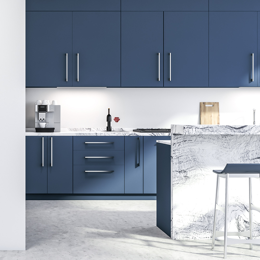
Monochromatic design uses various shades of one color to create harmony and unity in an interior space. For example, if you were looking to achieve a monochromatic look with blue as your base color, you could incorporate several different shades of blue such as light blue, navy blue, baby blue, etc., all within one room or throughout an entire building. This creates an overall unified look without making any one space feel overwhelming or cluttered.
Monochromatic design works best when used with lighter shades that are close together on the color wheel (such as light blues). However, it can also work with darker colors like black or grey if there is enough contrast between the different tones used in the room. Additionally, using white or cream as an accent color can provide balance while keeping within the monochromatic theme.
Also Read – Why Choose Multifamily Quartz?
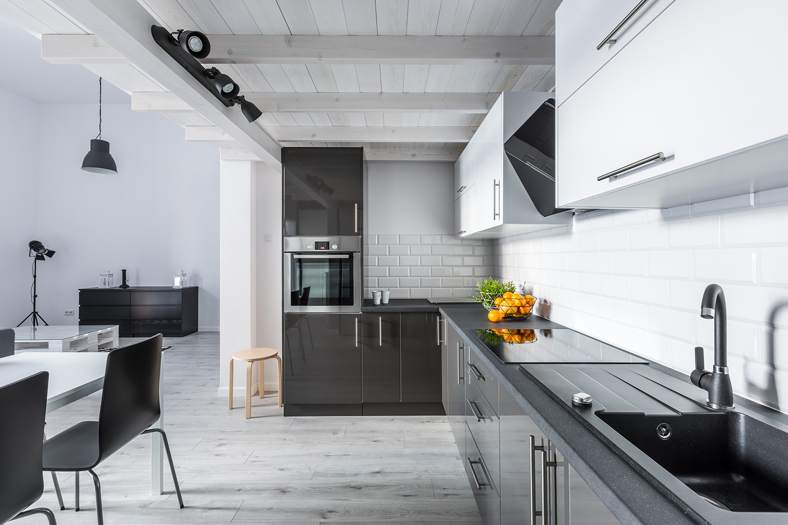
What is Achromatic?
Achromatic design is like monochromatic design in that it seeks to create harmony and unity in an interior space; however, this style uses only white, grey, black and their various shades to achieve this goal. The difference here is that instead of relying on just one hue (like blue), you can use several hues of neutral colors such as white, grey, and black. This allows for more flexibility when creating a cohesive look while still maintaining subtle differences between each space in your building.
How To Get A Cohesive Look From Both Of These Design Choices?
There are two main ways that you can combine both monochromatic and achromatic elements into your multifamily housing project: by creating contrast between each individual element or by blending them together seamlessly. If you want more contrast within your rooms, then use bold colors like blues or greens against neutral colors like whites or creams; this will create distinct separation between your rooms yet still maintain cohesion throughout your building as a whole. Alternatively, if you want more continuity between your spaces then opt for softer hues like pastels or muted colors against earthy tones like browns; this will result in all your rooms feeling interconnected while still providing subtle variation throughout each individual space.
Regardless of which method you choose—contrasting colors or blending hues—it’s important to remember that both monochromatic design and achromatic design can be used effectively in any type of interior setting including multifamily housing projects! So don’t hesitate to experiment with both styles before settling on one for your next build!
Conclusion
Monochromatic designs focus on using various shades of one color whereas Achromatic tend towards using various shades from across the entire spectrum – including black and white – for more flexibility when creating cohesiveness in spaces. Both Monochrome looks and Achrome looks can be used successfully in any interior setting including multifamily housing projects but it’s important to consider what type of atmosphere you are going for before deciding which style would be better suited for your next build! With careful planning and consideration, it’s possible to make either choice work so don’t hesitate to experiment before deciding on either option!